One Sheet, One Chance: The Quiet Power of the Indie Thriller Poster
You've got about three seconds.
That's how long a poster — or a streaming thumbnail, its digital descendant — has to convince a stranger that your movie is worth ninety minutes of their life. Studio films buy their way out of the problem with star faces and logo fonts the size of a billboard. Indie thrillers don't have that luxury. What they have is mood. And the best of them can pour an entire movie into a single image.
Noir Started It
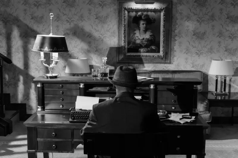
The DNA of the thriller one-sheet goes straight back to the film noir era of the '40s and '50s. Those posters were practically a genre of their own: hard shadows, a woman in distress (or in charge — sometimes both), a looming silhouette, and typography that leaned like it had something to hide.
The rules were simple and brutal. Show the danger. Hide the mystery. Sell the mood.
That formula never really died — it just went underground, resurfacing in the '90s with the era's iconic indie thrillers. Think of the posters for The Usual Suspects or Se7en: minimal, grimy, confident enough to promise dread without showing a single weapon. That's the lineage most modern indie key art is working in, whether the designers know it or not.
The Streaming Era Changed Everything
Then came the thumbnail.
When your poster is the size of a playing card on a living room TV, the rules shift again. Faces got bigger. Contrast got cranked. Neon — so much neon. The current wave of streaming-era thriller art tends toward saturated color blocks, high-contrast silhouettes, and a single striking image readable at 168 pixels wide. It's noir's philosophy wearing a rave outfit.
Some purists grumble. But honestly? The best of today's designs are doing exactly what those '50s one-sheets did — compressing an entire atmosphere into one glance. The tools changed. The hustle didn't.
What Makes a Poster Sell Danger
Strip away the trends and the effective thriller poster keeps relying on a handful of tricks:
- One dominant image. A face, a door, a lipstick mark, a knife. Never two competing focal points.
- Negative space as menace. What isn't shown is often scarier than what is. Empty space reads as the unknown.
- Color as a warning system. Red says blood or passion — ideally both. Sickly greens and cold blues say something is wrong with this world.
- Typography with an attitude. The title font is doing emotional labor. Sleek and thin whispers. Cracked and bold screams.
- A hook in the tagline. Five words or fewer that promise a secret. "One kiss. One secret. No way out." You get the idea.
Our Own Key Art, Confessed
Designing the poster for Kiss Me Kill Me meant honoring all of the above while trying to add one small thing to the tradition. We landed on a close-up — lips, a shadow, a smear of color where you'd expect innocence — set against a field of near-black. Minimal, noir-rooted, but with a palette hot enough to survive a thumbnail on a Friday night streaming scroll.
The reaction we hear most at festivals is that people can "smell" the movie from the poster. We'll take that. A poster shouldn't explain a thriller. It should make a promise and refuse to elaborate.
That's the lost art part of it, if it's really lost at all: restraint. Any designer can fill a poster. It takes nerve to leave most of it dark.
So next time you're scrolling for something to watch and a thumbnail stops your thumb mid-swipe — look closer. Somewhere in that single image, a designer made a hundred decisions on your behalf. The good ones you'll never notice. You'll just press play.